FerryOnline
Responsive Web Design & Development
FerryOnline is a comparison website that gives its customers exclusive deals when booking ferry crossing tickets with up to the minute prices sourced directly from the ferry provider themselves.
When the company acquired the FerryOnline website some time ago, it was very old-fashioned using a non-responsive approach. While retaining its branding the FerryOnline website was redesigned and rebuilt with a maintainable Bootstrap framework, with a mobile first approach and given a fully-responsive layout where the website scales to fit whichever browser or device a customer is using. The website draws from the one code base and was designed and built from scratch using hand-coded HTML and CSS with jQuery and JavaScript.

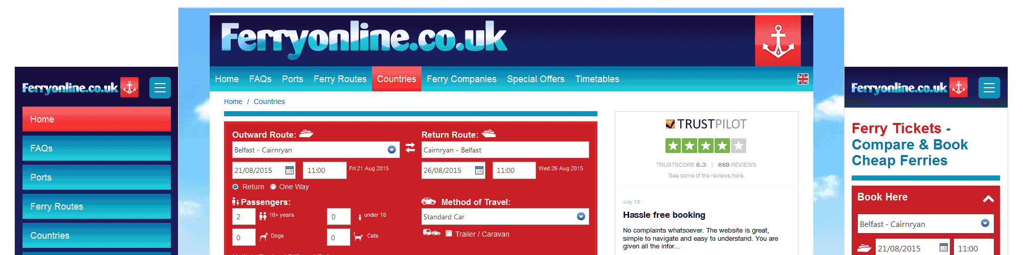
FerryOnline Responsive Web Design & Development
Homepage - Mobile, Tablet & Desktop Viewports

FerryOnline Responsive Web Design & Development
Ferry Operator Webpage - Desktop Viewport

FerryOnline Responsive Web Design & Development
Dover to Calais Webpage - Tablet Viewport

FerryOnline Responsive Web Design & Development
Homepage, MPU, Newsletter Sign-Up & Social Media Panels - Mobile Viewports

FerryOnline Responsive Web Design & Development
Navigation & Booking Engine Expanded - Mobile Viewports
Design
- Responsive Web Design
- User Experience
Development
- Web Development
- Mobile Development
- Digital Product Development